
Ever wonder why some photos just grab your attention and won’t let go? It’s not magic—it’s all about color. When it comes to photography, color is so much more than just a visual element. It’s a powerhouse that stirs emotions, sets the mood, and makes important details jump off the page. Whether I’m shooting products for an e-commerce store or snapping portraits, I’ve learned that understanding how to work with colors can truly make my photos pop. Let me walk you through the vibrant world of colors in photography and share some tricks on how you can use them to create striking, memorable images.
The Power of Color in Photography
Color isn’t just decoration in photography. It’s one of the most powerful tools to shape the message of your image. It affects how we feel, perceive, and even interpret a photo. Colors like red and blue can evoke entirely different emotions. In fact, color theory is a key aspect of how we compose stunning photos. But how do we make it work for us?
Color Theory: A Quick Overview
Before we dive deeper, let’s get familiar with the basics. Color theory in photography is all about understanding how different colors interact with each other. It’s based on the color wheel, which organizes colors into three main categories:
- Primary colors: Red, blue, and yellow.
- Secondary colors: Green, orange, and purple.
- Tertiary colors: A mix of primary and secondary colors.
From the color wheel, we can explore how colors relate to one another—through complementary colors, analogous colors, and more.
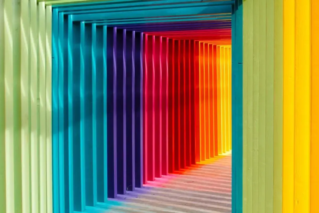
Types of Color in Photography: Warm, Cool, and Everything In Between
Credit: visualeducation.com
Understanding how to play with colors means knowing the different types available. Let’s break down the key categories of color that you’ll encounter in your photography journey:
a) Warm Colors in Photography
Warm colors—like reds, oranges, and yellows—add energy and warmth to your photos. They’re perfect for creating a cozy, inviting feel. These colors can help you emphasize certain elements, like the product you’re showcasing. Warm tones are also fantastic for setting moods. They bring warmth to your photo and draw the viewer’s attention.
- Think of food photography: warm colors make the image feel comforting and mouth-watering.
- Consider product photography: warm tones give a sense of luxury or elegance.
b) Cool Colors in Photography
Cool colors, such as blues, greens, and purples, often create a calm, serene atmosphere. They can also convey professionalism and cleanliness. Cool tones are great for conveying a sense of tranquility in portraits, landscapes, and even product shots where you want a clean, crisp aesthetic.
- Blues and greens, for instance, work great in natural settings.
- Purple hues can lend a touch of creativity and mystery.
c) Color Combinations and Their Impact
Combining colors can create visually striking effects. Here are a few combos that photographers often use:
- Blue and Orange: This complementary color combination creates strong contrasts, making each color pop. You’ll often see it in dramatic portrait photography or film.
- Red, Green, and Blue: The foundation of many color adjustments in photography. They’re the primary colors of light, and they work beautifully in creating dynamic images.
- Blues and Yellows: This combination evokes balance and harmony, making it ideal for product shots or serene landscape photography.
d) Tonal Contrast & High Contrast Photography
Contrast is everything in photography. It’s the difference between light and dark areas that makes an image stand out. Tonal contrast refers to the contrast in brightness (light vs. dark), while strong contrasts bring dramatic differences between colors. You can play with color contrast in photography to highlight key details in your images. For example:
- Using high contrast in product photography can create a bold, attention-grabbing effect.
- Tonal contrast can help add depth and dimension, making your images more visually engaging.
Also, if you want to know more about the right lenses for product photography, our guide on the best lens for product photography is a must-read!
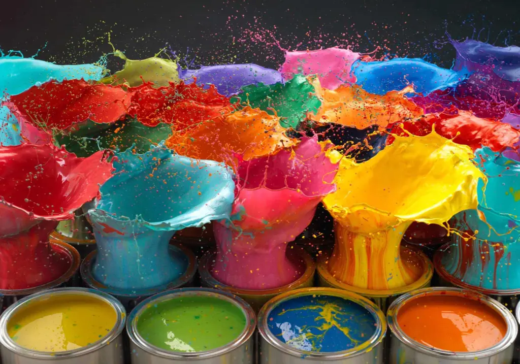
Techniques for Using Colors to Create Stunning Photography
Credit: hueandhatchet.com
Now that we’ve covered the basics, let’s talk about some practical ways to incorporate colors into your photos.
Use Color Grading to Set the Mood
Color grading in photography is the art of adjusting the colors in your image to set a specific tone. It’s one of the best ways to take your photos to the next level. Whether you’re trying to convey a cool, serene vibe or a warm, vibrant atmosphere, color grading allows you to achieve it.
- You can use cool tones for a chilled, modern look or opt for warm colors to add richness and warmth.
- Want a vintage or cinematic feel? Try adjusting the colors to introduce a specific color palette, like orange and yellow for a retro look.
Utilize Color Contrast in Photography
Want to draw the viewer’s attention to a specific part of your photo? Color contrast is the key! By placing complementary colors side by side, you can create a striking visual impact.
- A blue and orange color combination in a product photo can make your object pop out of the background.
- Pairing red with green (complementary colors) creates strong contrasts that immediately capture attention.
Work with Analogous Colors
Analogous colors are those that sit next to each other on the color wheel. These colors blend harmoniously and are great for creating a more subtle, cohesive look. If you want to maintain a calm, unified feel in your image, try working with analogous colors like:
- Blue and green for a natural, tranquil atmosphere.
- Orange, yellow, and red for a warm, fiery vibe.
Experiment with Color Tones
Different shades of the same color can convey various moods and styles. For example, a deep red can evoke passion and power, while a light pink brings softness and tenderness. Play around with different color tones in photography to see how they affect the overall mood of your images.
Need help with product photography? Check out our services for expert Amazon product photography or apparel photography. We’ll help you create captivating visuals that will attract customers.
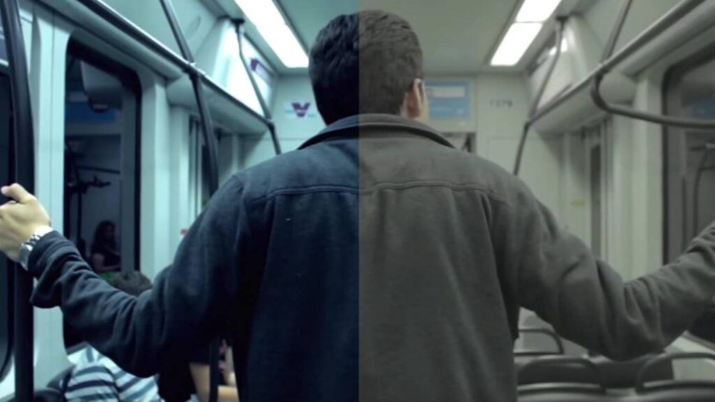
Credit: videomaker.com
Many photographers get confused between color grading and color correction. Here’s the key difference:
- Color correction is the process of adjusting the colors in your image to make them look natural. It’s about fixing the colors so that they look as accurate as possible.
- Color grading, on the other hand, is more artistic. It involves enhancing or changing the colors to evoke a specific emotion or create a unique visual style.
If you’re looking to give your photos a distinct look, color grading in photography is your go-to technique. But, if your images need to look as true-to-life as possible, then color correction should be your focus.
Final Word
Understanding and using colors in photography is essential to creating visually stunning images. Whether you’re capturing a vibrant product shot or a serene landscape, color plays a huge role in how your photo makes an impact. By experimenting with color contrast, color combinations, and color grading, you can transform your photography from simple to stunning.
Start experimenting with colors today and watch your photos come to life!
FAQs
Here are some of the frequently asked questions about colors in photography that you might find helpful.
What is color in photography?
Color in photography refers to the various hues and tones present in an image. It’s a powerful tool to convey emotion, set the tone, and highlight important elements of a scene.
How can I use colors to create contrast in my photos?
You can use color contrast by pairing complementary colors (like blue and orange) or working with tonal contrast (light vs. dark) to make certain elements of your image stand out.
What is color grading in photography?
Color grading involves altering the colors in your image to achieve a particular look or mood. It’s an artistic technique used to enhance your photo’s visual appeal.
How do primary and secondary colors affect my photos?
Primary colors (red, blue, yellow) and secondary colors (green, orange, purple) are essential to creating harmonious or contrasting images. Use them thoughtfully to guide the viewer’s attention or create strong visual contrasts.
What are the best colors for product photography?
The best colors depend on your product’s branding and the message you want to convey. Warm colors work well for luxury or food photography, while cool colors are great for tech or professional products.